The Black Rose
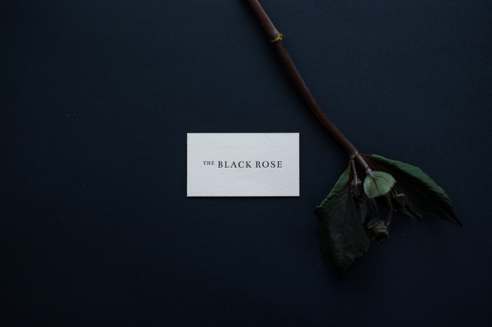
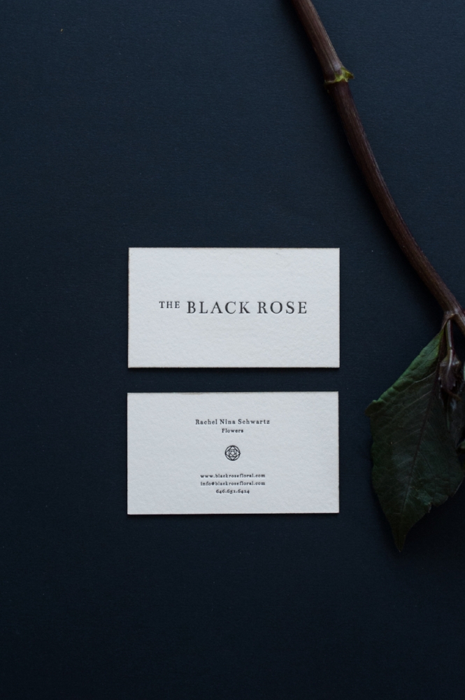
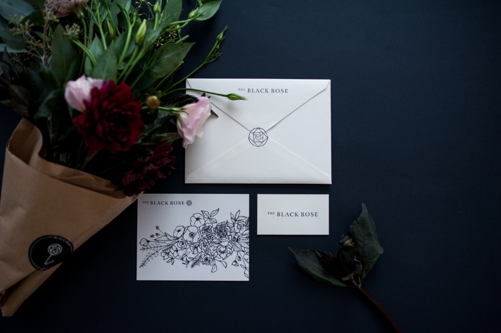
For the logo and identity of The Black Rose, we aimed for simplicity with a decorative touch of the old world. The rosebud icon, abstracted and illustrated by hand, recalls the lead framework of stained glass and references the early-1900s Wiener Werkstätte style that inspires owner Rachel Nina Schwartz.
We designed a range of printed materials, including business cards that were letterpress printed and edged in metallic gold, plus patterned tissue paper and branded stickers for hand-tied bouquets.
OUR WORK
Branding / Identity
Stationery & Packaging Design: Business Cards, Labels, Letterhead Template, Tissue, Postcards
CREDITS
Letterpress Printing: Presshaus LA
Styling & Photography: Emilie Anne Szabo
SEE MORE
The Black Rose